Monday, November 29, 2010

A little color for everyone_ color transforms

     Since its release in September 2005, the iPod nano has been every shade under the sun. Each model's launch delivers a new spectrum of hues for the miniature mp3 players. The iPod nano's wide variety offers a shade for everyone. Thus, the ipod's hue that appeals to a consumer's eye most will be the one purchased. 
     Although the iPod Nano comes in approximately the same color options with each release, they are offered in different hues ranging from soft, metallic pastels to rich, shinny neons. In regard to Alber's thesis that color is subjective in his book "The Interaction of Color", everyone perceives the Nano's hues differently. One who might love the newest generation's emerald green may disdain the great grandparent version's sea foam green. He or she may love the color green, but only when it is the rich green that attracts their eye and likeness as found coloring the newest version.  
     Apple's design team's decision to change the color of the Nano's hues with each generation that is released is a great way for Apple to sell millions of iPod's. With each launch, an individual will grow fond to a particular one above the rest. Due to our nature to crave to possess the latest piece of technology, we convince ourselves to purchase a new model. Thus, by offering a new model of iPod, not only offered in nine colors, but in nine never-before-seen hues, the number of people who feel the need to purchase the new Nano is exponential. That same green iPod will be just the right shade of green for so many people even though they may be perceiving it differently. 


**Images above depict Apple's Nano in order from newest (excluding the model most recently released) to oldest

Cred:


Designed to Improve Society

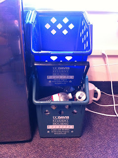
     Here at UC Davis in the dorms, housing services provide every room with two recycle bins, one for paper and one for cans and bottles. These bins are specifically designed to improve the recycling habits of the UC Davis campus by making it extremely easy to throw away waste. Also, they are crafted to not take up too much space in the small quarters they are used in. Complete with a lip along their insides, the containers have the ability to stack on top of one another to save space. A college student is more inclined to keep the bins in their room if they do not interfere with more important objects in his or her room. Also, the bins have handles to make transporting the recycles easy. One cannot complain about having to change a bag or about his or her inability to move an awkwardly shaped receptacle. In addition, the containers are color coded so one can make associations. One can quickly pick up that blue means paper and green means cans. With time, one's brain does not even have to think about what goes where, but does it naturally. The University makes a smart move when keeping recycling simple and easy by narrowing it down to two bins. While they are asking you to sort your waste, it is not that extensive. Recycling may require just a bit more effort but they make it simple and accessible enough to where even the laziest student has no problem doing so. 
     These bins are aiming to improve UC Davis' "society" by making it extremely simple to recycle and thus reuse our waste instead of throwing it away. By recycling we are wasting less and helping Davis, California, The United States, the Earth, become a "green" planet. Dreams of creating such a place is extremely Utopian in theory but by using these bins and recycling our waste we are one step closer to making that a reality. 

Cred:
My personal iPhone, photographer in my dorm room 

Design is DANGEROUS


     The pizza cutter. Designed to make pizza slicing fast and easy, this kitchen utensil has DANGER written all over it. What makes such a useful tool so dangerous? With its large, sharp cutting surface, it's user puts his or her fingers in the line of fire. Get your hands, arms, fingers, knuckles, to close and you could find yourself with a deep gash in the blink of an eye. The joint with which the blade is attached allows the sharp blade to move freely and continuously. Also, due to the use of smooth metal, the blade meets no traction at its joint and can spin freely and quickly. Because of this, the cutter can easily slip or glide out of control, leaving its user with a wound. In regard to the specific cutter pictured above, the smooth, sanded handle provides no grip and can easily become slippery when covered in ingredients or the standard pizza grease. When too slick to get a good hold of, the cutter has a higher chance of failing at its job, cutting you rather than your pizza. 
     Although you risk loosing a finger when using the cutter, the object was not designed to be such a danger. On paper, this design is genius; no more hacking away at your pizza with a knife, just simply roll the cutter right on through to quickly and evenly divide up your pie. 


     Not until the injuries began "rolling in" did the design of these cutters change. Today one can find new cutters on the market that offer greater safety. For example, the inclusion of a gel-like handle offers greater grip and thus increased control of the blade. Also, some companies have redesigned their tools with guards against accidental injuries. The inclusion of plastic guards and placement of the handle over the plastic, incased blade leaves your hand free from injury even if it happens to slip out of your greasy hand. 


Cred:
http://thewhitedsepulchre.blogspot.com/2009_07_26_archive.html
http://gadgether.com/bizarre-kitchen-gadgets/

Monday, November 15, 2010

Ergonomics, meet Camel No.9


The well-identified cigarette. With ten million being sold every minute worldwide (1), the cigarette is a well-known object. Cigarettes are the most advertised product in the United States (2). You can find them anywhere: in your magazines, on billboards, on the BART train. Companies use bright colors, catchy slogans and embellished characters to appeal their youthful audience. For example, Camel brand cigarettes uses their Joe Camel symbol along with targeting specific audiences, to sell their products. While its use can lead to lung cancer and even death, The Camel No.9, with an attention to detail and ease of use and consumption, is a successfully-designed product.
We all know it’s true that cigarettes are terrible for you. Tobacco kills one person every ten seconds (3) and they are still being sold accessibly and legally. Nothing about this product offers you much safety. In regard to a cigarette advocate, the Camel No.9 is a light cigarette so it offers you less tobacco and nicotine. Also, it has a filter that blocks the “bad things” that could go through. While they do offer this nice feature, it really offers little to no protection. Let’s be honest, your smoking tobacco and nicotine, the leading cause of lung cancer, the disease which kills more people a year than AIDs, drug abuse, car accidents and homicide combined (4)! Camel advertises the inclusion of a filter and being “light”, in order to appeal to its feminine female audience, who appreciate feeling and looking healthy. This is a smart tactic in order to boost sales and truly appeal to their target audience. The actually object of the cigarette is not safe to use or consume, but Camel uses smart methods to give the illusion of a “healthier” cigarette.
People have mixed reviews on their comfort level, or like-ability of the No.9 depending on where they are in their smoking career. From reading reviews, it is clear that the products contained in the cigarette are concocted to appeal to a new smoker. Almost all seasoned smokers claim the No.9 cigarettes feel like “sucking air through a straw”(5). It makes sense that Camel would create a cigarette appealing to novice smokers in correlation to the name, packaging, and appearance of their product. Camel made a smart move to cater their ingredients to a younger, more feminine set.
 The No.9 Camel is very easy to use, both in terms of ease at where to buy and how to use them. The specific cigarette can be found in most gas stations, corner stores, and mini marts that litter modern America’s towns and cities. Almost anywhere in the United States can one find any of these retail locations and pick oneself up a feminized pack of Camel’s. Camel’s are sold everywhere, and are easy to find if you want them. The box of the cigarette is easy to open and unfold. One can simply withdraw their cigarette from the pack, balance it carefully between his or her pointer and middle finger, flick his or her lighter and inhale to ignite their “precious” cigarette. Like all cigarettes, Camel sells a product that comes with a simple step-by-step process that becomes habitual with regular consumption. Easy to find and easy to use, the No.9 couldn’t score higher in this category.
The No.9 specifically targets those they are selling to, young women. With its correlation to Chanel and the marking of a pink camel on the cigarette , no girlie girl can resist such a tame looking delicacy. Because of this, No.9’s do extremely well in sales. Camel designs their product to appeal to the "chic" girl who would desire a pink cigarette. She is willing to spend whatever on her cigarette because she loves how cute and feminine they are. They make her feel less “yucky” when smoking. These are all things Camel takes into consideration when designing their product in order to reach maximum productivity. 
The packaging and cigarette of No.9's scream female! The resemblance to high end Chanel designs gives the idea that so too are the No.9’s. The color pallet is feminine, modern, and youthful to further appeal to the young generation. The cigarette is slender, almost resembling a woman’s figure. Camel keeps it simple and colors the cigarette a pure white with a simple pink stamp of their iconic mascot. This simplicity gives the product that “cool” factor. In plain terms, if Barbie smoked a cigarette, she would choose No.9’s.
Let’s face it, Camel has a highly attentive marketing team that is superb at appealing to their audience. Even with their product having the potential to kill, they still are able to make every young female want to try one, or at least keep a pack in her purse. If you can fool so many into that, there is no denying your design’s success. There is nothing left to say but, hats off to you Camel, for tricking the girls of our future into lung cancer!

Cred: 

Footnotes:

Tuesday, November 9, 2010

CHECK IT OUT

      After seeing Minaj's video for "Check it Out" and discussing it in class I came to the conclusion that her video is designed in homage to K pop videos and music. It is undeniable that Minaj was inspired by the K pop genre when making her video. What makes this most clear is the use of the japanese text in the background. Even if one was not familiar with the K pop genre, the Japanese words make the video seem, at the very least, Asian inspired. As an homage, Minaj exaggerated things common to K pop videos like video style, clothing, dance moves, etc. In the video, Minaj and her back-up dancers wear bright colors and futuristic costumes. Their clothing is not something someone would wear on an average day but more closely related to the costumes from the Disney Channel Original movie "Zenon, Girl of the 21st Century" (http://en.wikipedia.org/wiki/Zenon:_Girl_of_the_21st_Century_(film) ). This clothing resembles almost all the ensembles from any Japanese K pop video. Also, Minaj's song is catchy, repetitive and the words don't have much significant meaning. This is nearly the definition for all K pop music. Both Minaj's and K pop artists' 2NE1 videos mimic their music and are repetitive and lack a significant story line or meaning. Take a look at 2NE1's video and it will be hard to deny the two videos' similarities. 


Cred:
1. http://www.youtube.com/watch?v=pqky5B179nM
2. http://www.youtube.com/watch?v=ISEoXdHb4W4 

Monday, November 8, 2010

When Words and Images Get Clever

     In response to my google search for clever advertisements I found this one for weight watchers. Unlike the Advil bottle from my last post, that used simple language and words repeatedly to get their message across, here they keep it very simple and almost abstract to symbolically show the effects of the Weight Watcher program. While the message is abstract and not so neatly laid out for you, an adult can easily decipher what is being said. It does not matter that a child may not understand because they are not the target audience of the project. No child is interested in or needs to be on the Weight Watcher program. To the adult it is clear that when you start the program you enter through the "big" door as a fat, unhealthy person. Then as your eye moves from left to right you notice the Weight Watcher's logo between the entrance and the exit. This implies the use of the product. As our view meets the end of the photo on the right, you see a skinny door that says "exit". Through the use of one simple word on top of the image of a narrow door one can deduce that the program will leave you skinny and lean enough to have the ability to use the small door. The use of simple language combined with simple images and things we find in everyday living makes this a highly effective advertisement that cleverly conveys the desired intent of the product, Weight Watchers! 


Cred:
http://www.diamondvues.com/WW-Doors.preview.jpg

Spelling it out for you,,, Word Meets Image

     I came across this Advil bottle design while stalking other blogs. It screamed out to me how advertisers rely on the use of image and word to easily convey their message. On the two pictured sides alone the box states that there is an easy open arthritis cap. The writing is also always located right on or near a picture of the "easy" cap. Advil wants to make sure their consumer knows just how easy this new bottle is to use. They marry both word and image to make it undeniably clear what they are selling. They then use this method so repetitively that the consumer cannot even glance at the product without its intent being known. This is a highly successful method of getting one's product out there, simply by inundating the buyer with easy to understand words and images. The two work hand in hand so that all types of learners can understand. If one does not understand why the cap is so oddly shaped, they can read to realize it is specially designed for people with arthritis. On the other hand if someone with arthritis is drawn to the product because the box claims to be beneficial to someone with the disorder, the consumer can get a visual image of how the design caters to him or her. Word and image work off one another. Thus, neither can stand alone and be nearly as successful. 

Cred:

Oh Juergen, How I adore Thee

     The photography of Juergen Teller has swept the modern advertising world by storm. His work can be seen in the ad's for Marc Jacobs, YSL and Vivienne Westwood. Off of my previous post "discussing outtakes", Teller's work is commonly designed in the manner to appear "undesigned" as seen in the photograph above. It looks like a moment frozen in time, as if the photographer was just bombarded by a beautiful heel clad woman juxtaposed on a rugged skateboard. Whenever I look at this image I wonder just how many outtakes exist and how long it took Teller to capture this perfect moment.
     I love the contrast of elements in this photo. The contrast of a creamy, smooth and white leg to harsh and black, makes the statement that these two things do not match. The ornate, vintage gold background further contrasts with the subject in the foreground, making the viewer yearn for greater context. The model and her belongings are very modern whereas the background looks as if it is from the time of Marie Antoinette. She seems very out of place and gives the impression that she is doing something she shouldn't, as if she is partaking in mischief. The swirling lines of the background curve in a way that corresponds to the model's legs. Thus, the background moves the model along through the picture, further implying her motion.I think the elements of design are successfully used in this image to portray the act of motion. 


Cred:
http://lifeinlomo.blogspot.com/2008/11/juergen-teller.html

Monday, November 1, 2010

Discussing Outtakes

     This poster hangs in my dorm room next to my desk and I find my eye uncontrollably wandering to it when I should be studying. The photograph, like many we find in the fashion magazines of today, gives the impression that it is an outtake, a snapshot, a photograph unplanned. This begs the question of whether or not this advertisement is "designed". 
     In my opinion, a photograph of this nature is in fact designed. While the movements of the models don't hold any specificity, their outfits, the room, and the use of film as opposed to digital, were very much designed. Someone had an idea in their mind of what mood they wanted the ad to evoke. The unposed position of the models in fact heightens the mood of a grungy motel room. The mess of the clothing, bedding, AND model's juxtaposition creates an unyielding sense of chaos. 
     While this photograph is messily constructed, many principles and elements of design are used in tandem to create an effective advertisement. One's eye is immediately drawn to the white tone of the right model's shirt. Once the eye is caught, it moves down the line of the leg and towards the other model. Her long blonde (almost white) hair draws the eye down her form. Once down her arm, one's eye gets lost in a flurry of flash and mis-focus across the bed, leading the eye right back to our original model. This construction creates a simple triangle with which the eye can consistently move. One's eye is in constant motion and thus constant analysis of this portrait. Each cycle can lead the eye to notice new things, like the phone in the blonde models hand or the bullets slung across the headboard. Thus, more of the content of the photograph is unveiled and leaves the viewer wondering just what is happening in this "random" moment. The element of line is successfully used in this designed photograph to catch its viewers eye and lure them to a point of closer analysis and hopefully, a closer look at the product for which it is advertising. 

Cred:
Ich, mich, mir... ME, from da iPhone

Analyze a Single Object

             The Lego, produced in millions, a childhood toy that is so simple but can consume the young minds of builders all over the nation. At first glance we notice that this toy is made out of plastic. Its shiny, smooth surface feels soft to the touch. The sharp, cold, geometric shape contrasts with the soft feel of the block. While the surface is smooth, the form is rough and structured. The top of the brick gives way to a repetitive row of circles, subtly labeled with the logo "lego". These circular forms then correspond to the indentations along the bottom side of the lego. The circles can then lock into place when stacked upon one another. There is an emphasis on these circles for many reasons. One, they protrude further than the rest of the form, creating uneven negative space around the object. Also, their logo label on each circle creates an embossed texture than is unlike the smooth surface of the block. Finally, there is an emphasis on them due to their necessity related to function. Without these lifted circles, the lego blocks would have nothing to attach onto and thus your lego would serve no building function. 
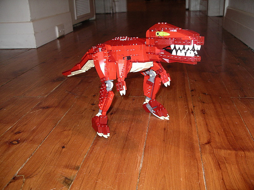
     Provided with a variety of brick sizes, and colors, the creator has endless possibilities for creation with his or her lego's. One could stack the lego's in alternating order of color to create a harsh contrast from line to line of lego brick. This also gives way for opportunity to design structure's full of repetition, giving way to rhythm of pattern or form. The individual blocks act as pieces of what the mind uses to create a unified whole, a Gestalt of lego creation. The lego brick can be thoughtfully combined to give the illusion of being one object. 


Cred:
1. http://idletigers.files.wordpress.com/2008/01/lego-bricks-high-resolution.jpg
2. http://htmlgiant.com/wp-content/uploads/2010/04/57184557_b7cd583754.jpg

Interaction of Content and Form in Objectified

      In the documentary "Objectified", the film forces its viewer to take a closer look at the forms of everyday objects and reconsider why they are formed that way. The film immediately does this by posing these questions while cycling through a series of tightly cropped frames. In doing so, one looks at the object close up, both physically and in their mind, and thus sees it in a new light. I consider this as a highly effective method of combining the form of the objects with the content in which the film is addressing.   The marriage between content and form becomes increasingly more evident as the film progresses. To further the initial questions the film asks, they then show objects being made. For example, they look at the formation of an Apple desktop computer. The viewer is shown a piece of metal next to the basic frame shape of the computer. It is then explained how the piece of metal is transformed into the skeleton of the machine. This only sparks the mind further by inspiring thoughts of the process from basic material to amazing technology. The film provides such examples to keep their viewer's mind moving around the film's basic content of looking closer at objects.   Diving deeper towards unearthing the process of creating, the film also introduces an array of esteemed designers. This provides the viewer with a face with which to connect the design of a specific object to. One does not look at a lamp and wonder who designed it, but rather, with the intent to have it provide light. The film helps it's viewers look past what the naked eye assumes by giving them visual proof that REAL PEOPLE spend a lot of time creating things we take for granted.     
  "Objectified", by taking a closer look at objects, both in the literal sense, and by looking at the background information, successfully uses form to better convey the film's content. The tight crops off the objects and the description and insight into the creator's and how their things are created, lend way to a new mindset on objects that could leave the mind ruminating for days.

Cred: